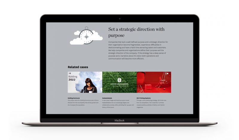
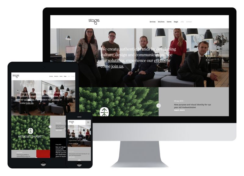
We are very excited and proud to present our new Stagis universe. Besides a new design for our newsletter and blog, the universe also introduces our new and contemporary website that invites you to dive into our 18 years of business. What better way to end a successful year than by telling a new and inspiring story about Stagis.
New features of Stagis.com
The new website gathers all there is to know about Stagis and our work in a completely new structure. The services page elaborates on the unique combination of strategy, culture, and design, that characterizes our work and processes. In the beginning of 2016, we will develop the page to include more in-depth information about our services and give examples on each type. Solutions describe the challenges we specialize in solving and present selected cases that show how we have helped organizations cope with specific challenges. This page will also be updated continuously with new inspiring cases allowing you to find some of our best work that illustrate how we work and the results we have achieved together with our clients. Furthermore, the new website allows you to read about past and upcoming events, the talented people working in Stagis and highlights from our last 18 years of business.

The new Stagis Journal
The Stagis blog that we built in 2005 is now called Journal. The new name matches the magazine-feel of the medium, where you can follow ongoing projects, read articles, thoughts and ideas from our work. The front page features the newest and most important articles from our Journal, and gives you a shortcut to your latest projects.

Responsiveness and scalability
Last year the phone beat the computer as the most used devise for using the Internet worldwide. The growing tendency among users to use their phones to access the Internet makes it increasingly important to accommodate the different characteristics of computer screens, tablets and phones. As a result, our new website incorporates a high level of both responsiveness and scalability that makes it possible for you to access the website on all devises while ensuring a high quality experience. The website further adjusts the content as you scroll down the page to give you the ultimate experience.

Exploiting the format
Another important feature on the new website is the use of big photos, video and a spacious composition. Moving pictures and video vitalize the website and invites you to enter a visual universe of cases and events. The broad pictures utilize the different formats – especially on large displays on your computer – to their fullest and capture your attention throughout your visit on the site.
It is safe to say that we are extremely proud of our new universe. We hope you will enjoy our new website and Journal as much as we do and dive into our cases and latest projects. You can read more about how we have helped Hedeselskabet and Master of Public Governance at Copenhagen Business School develop their websites, and thereby communicate their story and brand effectively.


