We recently designed this new logo for a French startup company called Otodeck. Otodeck is a platform for driving schools that helps to increase visibility on the Internet and attract new customers who would otherwise not have known about a particular driving school. We created a typographic logo and added two simple lines to the name to create a visual reference to the road, an element that all driving schools have in common, but very few use. In addition, this portal will be the road to choosing your driving school in France.

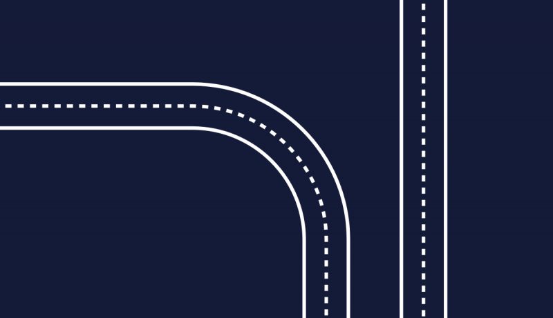
The colours are inspired by the dark blue asphalt and the yellow and white stripes.
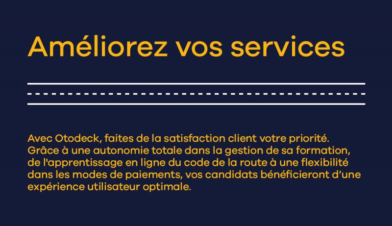
The roads and the stripes can be used as a symbol and graphic element when Otodeck wants to unfold their visual identity later on. For example the stripes can be used as a separation line in a layout or it can be used to create patterns and visual references on all types of surfaces and digital solutions.
At Stagis we love to help companies find and define their unique strengths and express them through corporate visual identity to help the business communicate and grow. In this case we are helping a small startup, hoping we have given Otodeck a hand in growing bigger and getting success on the French market.


